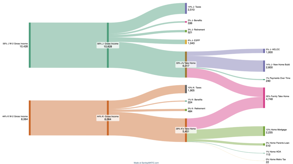
Let’s just get straight to the visual of this Sankey diagram creation. Look at this beauty!

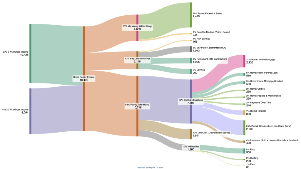
This way of visualization, at least I find, makes understanding where our individual money is going, and what we have available to spend every month together very easy.
I was first introduced to this type of graph while playing around with the Financial Planner web app. [p.s. – that’s a great app that helps plan early retirement and financial independence scenarios and I recommend giving the trial a test go]
Here’s another Example. Same data, but a different way of grouping and representing our family cash flow in a unified way.

Check out SankeyMATIC, a Web site app that helps generate these sorts of diagram. This is the app that I used to create the example financial flow diagram above. This is what I, Mr. ToW, and future Mrs. ToW used recently to assess where our money goes. Of course, we still use Quicken, spreadsheets. But, we are both visual people and like to see cash flow more tangibly and a Sankey diagram does just that.
That’s all I’ve got to say. If you haven’t seen these sorts of diagrams, check them out. And check out the free to use SnakeyMATIC Web site to create your own charts for free!


Leave a Reply